🖤 What Makes This Editorial Image Stand Out?
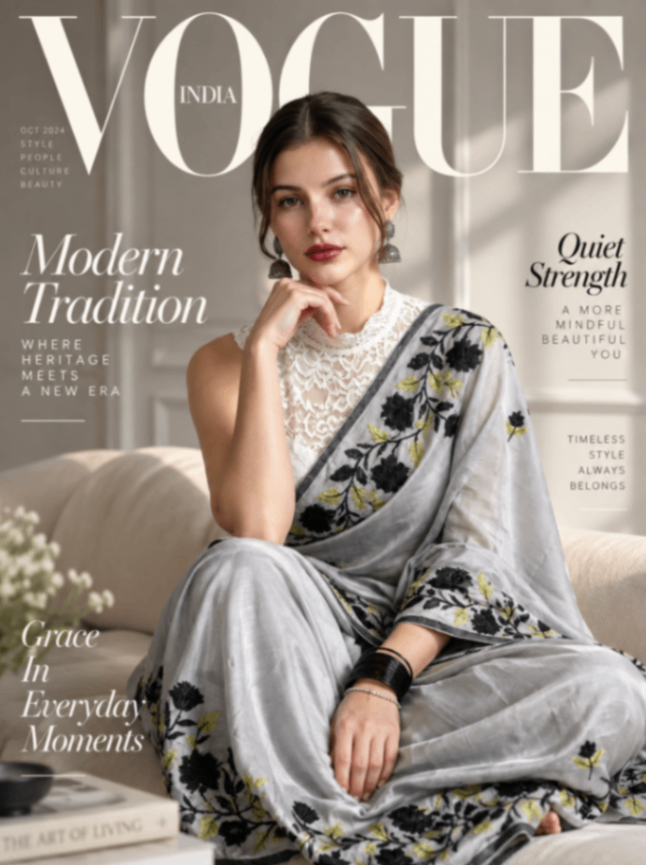
This image feels like a high-end fashion magazine cover—elegant, sophisticated, and deliberately composed. It combines Indian heritage with contemporary luxury fashion, giving it a timeless editorial identity.
1. The magazine-cover composition is extremely strong
The oversized “VOGUE” typography immediately establishes the visual hierarchy. The model sits naturally within the letters instead of the typography simply being placed on top of the photo.
2. “Modern Tradition” is the core concept ✨
The sari, traditional earrings, bangles, and floral embroidery communicate heritage, while the clean styling, neutral interior, and minimalist typography make the image feel contemporary.
The whole concept can be summed up as:
“Where heritage meets a new era.”
3. The muted color palette feels luxurious 🤍
Soft whites, warm beige, black floral details, and subtle olive-green accents create a sophisticated palette. Nothing feels excessively saturated, which is exactly why the image has that premium editorial quality.
4. The lighting is beautifully controlled ☀️
Soft natural window light falls across the face and sari, creating gentle highlights and shadows. It feels like an intentionally lit fashion shoot rather than a casual photograph.
5. The pose communicates quiet confidence
The relaxed posture, hand near the face, direct eye contact, and subtle expression create a sense of confidence without exaggeration.
That's perfectly aligned with the headline:
“Quiet Strength”
6. The typography tells a story 📰
There are multiple layers of editorial copy:
Modern Tradition
Quiet Strength
Grace in Everyday Moments
Where Heritage Meets a New Era
Timeless Style Always Belongs
These aren't random decorations—they reinforce the central fashion story.
🎨 Overall Vibe
I'd describe this as:
“A contemporary Indian fashion editorial celebrating heritage through modern elegance.”
Style: 🖤 Luxury Editorial × Indian Heritage × Minimalist Fashion × Magazine Cover